
Analyzing Millions of Taxi Trips in the City of Chicago
The City of Chicago’s open data portal provides a large amount of human mobility data, including taxi trips, TNP rideshare trips, Divvy bikeshare trips, and E-scooter trips (data in 2019, data in 2020, data since 2022). There is a brief summary (see the following table) of annual trips of these travel modes in the City of Chicago, depending on the data availability. More detailed statistical analysis (e.g., daily and monthly aggregates) of taxi and ridehailing usage in Chicago can be found in this post, including total trips/farebox and average trip duration/distance/fare/speed.
| Year | Taxi trips | Rideshare trips | Divvy trips | E-scooter trips |
|---|---|---|---|---|
| 2013 | 21.6M | 760K | ||
| 2014 | 32.0M | 2.45M | ||
| 2015 | 27.3M | 3.18M | ||
| 2016 | 26.7M | 3.60M | ||
| 2017 | 22.0M | 3.83M | ||
| 2018 | 18.7M | 3.60M | ||
| 2019 | 14.6M | 96.9M | 3.82M | 711K |
| 2020 | 3.46M | 42.1M | 3.54M | 631K |
| 2021 | 3.37M | 42.2M | 5.60M | |
| 2022 | 5.47M | 57.3M | 5.67M | 1.49M |
| 2023 | 5.79M | 68.7M | -M | 2.31M |
Taxi data is available since January 2013, TNP rideshare data since November 2018 (see the download pages of trips (2018 - 2022) and trips (2023 -)). As of 2019 there are three licensed TNPs in Chicago: Uber, Lyft, and Via. The TNP dataset does not identify which company provided each trip.
Notably, despite the taxi and ridehailing usage in Chicago, one can also check out the taxi and ridehailing usage in New York City. Below is a summary of NYC taxi (e.g., yellow taxi) and rideshare (e.g., high volume for-hire vehicle (HVFHV)) trips over the past few years, depending on the data availability at the TLC trip record data.
| Year | Taxi trips | Rideshare trips |
|---|---|---|
| 2011 | 176.9M | |
| 2012 | 171.4M | |
| 2013 | 171.8M | |
| 2014 | 165.4M | |
| 2015 | 146.0M | |
| 2016 | 131.1M | |
| 2017 | 113.5M | |
| 2018 | 102.9M | |
| 2019 | 84.6M | 234.6M |
| 2020 | 24.6M | 143.3M |
| 2021 | 30.9M | 174.6M |
| 2022 | 39.7M | 212.4M |
| 2023 | 38.3M | 232.5M |
Visualizing Boundaries of Community Areas in Chicago
The data can be viewed on the Chicago Data Portal with a web browser, see 77 community areas in Chicago. To use these data, one can export and download the data in the Shapefile format. In this post, we rename four files of the Shapefile data as follows,
areas.dbfareas.prjareas.shpareas.shx
and place these files at the folder Boundaries_Community_Areas.
Then it is not hard to use the geopandas and matplotlib packages in Python to visualize the boundaries of community areas.
import geopandas as gpd
import matplotlib.pyplot as plt

fig = plt.figure(figsize = (14, 8))
ax = fig.subplots(1)
shape = gpd.read_file("Boundaries _Community_Areas/areas.shp")
shape.plot(cmap = 'RdYlBu_r', ax = ax)
plt.xticks([])
plt.yticks([])
for _, spine in ax.spines.items():
    spine.set_visible(False)
plt.show()
fig.savefig("boundaries_community_areas_chicago.png", bbox_inches = "tight")
Figure 1 shows the boundaries of 77 community areas in the City of Chicago. Note that we can set the cmap as RdYlBu_r or YlOrRd_r.
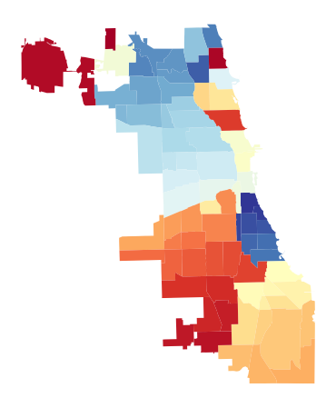
Figure 1. Boundaries of community areas in the City of Chicago, USA.
Matching Taxi Trips with Community Areas
There are three basic steps to follow for processing taxi trip data:
- Download taxi trips in 2022 in the
.csvformat, e.g.,Taxi_Trips_-_2022.csv. - Use the
pandaspackage in Python to process the raw trip data. - Match trip pickup/dropoff locations with boundaries of the community area.
import pandas as pd

data = pd.read_csv('Taxi_Trips_-_2022.csv')
data.head()
For each taxi trip, one can select some important information:
Trip Start Timestamp: When the trip started, rounded to the nearest 15 minutes.Trip Seconds: Time of the trip in seconds.Trip Miles: Distance of the trip in miles.Pickup Community Area: The Community Area where the trip began. This column will be blank for locations ourside Chicago.Dropoff Community Area: The Community Area where the trip ended. This column will be blank for locations outside Chicago.
df = pd.DataFrame()
df['Trip Start Timestamp'] = data['Trip Start Timestamp']
df['Trip Seconds'] = data['Trip Seconds']
df['Trip Miles'] = data['Trip Miles']
df['Pickup Community Area'] = data['Pickup Community Area']
df['Dropoff Community Area'] = data['Dropoff Community Area']
del data
df
By doing so, there are 6,382,425 rows in this new dataframe. For the following analysis, one should remove the trips whose pickup/dropoff locations outside Chicago. In addition, one should clean the outliers that are with 0 (trip) seconds or 0 (trip) miles.
df = df.dropna() # Remove rows with NaN
df = df.drop(df[df['Trip Seconds'] == 0].index)
df = df.drop(df[df['Trip Miles'] == 0].index)
df = df.reset_index()
df = df.drop(['index'], axis = 1)
df.to_csv('taxi_trip_2022.csv', index = False)

import numpy as np

print(np.mean(df['Trip Seconds'].values))
print(np.mean(df['Trip Miles'].values))
By doing so, there are 4,763,961 remaining taxi trips in the dataframe. If you want to aggregate the trip counts of each pickup/dropoff community area, the simplest way to get row counts per pickup/dropoff community area is by calling .groupby().size().
pickup_df = df.groupby(['Pickup Community Area']).size().reset_index(name = 'pickup_counts')
dropoff_df = df.groupby(['Dropoff Community Area']).size().reset_index(name = 'dropoff_counts')
Visualizing Pickup and Dropoff Trips in 2022
It is not hard to first use the geopandas package to merge pickup/dropoff trip counts into the .shp data and then visualize the trip data with the matplotlib package.
import geopandas as gpd
import matplotlib.pyplot as plt
plt.rcParams['font.size'] = 14

chicago = gpd.read_file("Boundaries_Community_Areas/areas.shp")
pickup_df = df.groupby(['Pickup Community Area']).size().reset_index(name = 'pickup_counts')
dropoff_df = df.groupby(['Dropoff Community Area']).size().reset_index(name = 'dropoff_counts')
pickup_df['area_numbe'] = pickup_df['Pickup Community Area']
dropoff_df['area_numbe'] = dropoff_df['Dropoff Community Area']
chicago['area_numbe'] = chicago.area_numbe.astype(float)

pickup = chicago.set_index('area_numbe').join(pickup_df.set_index('area_numbe')).reset_index()
dropoff = chicago.set_index('area_numbe').join(dropoff_df.set_index('area_numbe')).reset_index()

fig = plt.figure(figsize = (14, 8))
for i in [1, 2]:
    ax = fig.add_subplot(1, 2, i)
    if i == 1:
        pickup.plot('pickup_counts', cmap = 'YlOrRd', legend = True,
                    legend_kwds = {'shrink': 0.618, 'label': 'Pickup trip count'},
                    vmin = 0, vmax = 1.4e+6, ax = ax)
    elif i == 2:
        dropoff.plot('dropoff_counts', cmap = 'YlOrRd', legend = True,
                     legend_kwds = {'shrink': 0.618, 'label': 'Dropoff trip count'},
                     vmin = 0, vmax = 1.4e+6, ax = ax)
    plt.xticks([])
    plt.yticks([])
plt.show()
fig.savefig("pickup_dropoff_trips_chicago_2022.png", bbox_inches = "tight")
Figure 2 shows taxi pickup and dropoff trips (2022) on 77 community areas in the City of Chicago. Note that the average trip duration is 1207.75 seconds and the average trip distance is 6.16 miles.

Figure 2. Taxi pickup and dropoff trips (2022) in the City of Chicago, USA. There are 4,763,961 remaining trips after the data processing.
Figure 3 shows rideshare pickup and dropoff trips (2022) on 77 community areas in the City of Chicago. Note that the average trip duration is 953.26 seconds and the average trip distance is 5.19 miles.
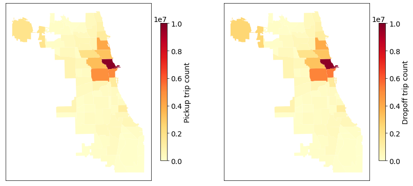
Figure 3. Rideshare pickup and dropoff trips (2022) in the City of Chicago, USA. There are 57,290,954 remaining trips after the data processing.
For comparison, Figure 4 shows taxi pickup and dropoff trips (2019) on 77 community areas in the City of Chicago. Note that the average trip duration is 915.62 seconds and the average trip distance is 3.93 miles. Figure 5 shows rideshare pickup and dropoff trips (2019) in which the average trip duration is 987.51 seconds and the average trip distance is 4.88 miles.
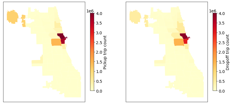
Figure 4. Taxi pickup and dropoff trips (2019) in the City of Chicago, USA. There are 12,484,572 remaining trips after the data processing. See the data processing codes.
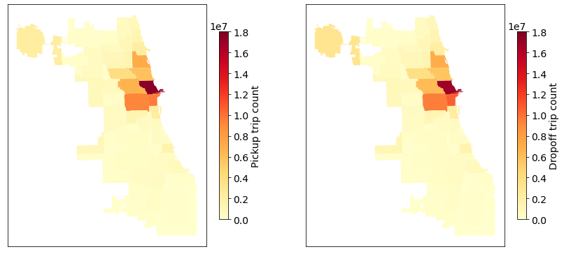
Figure 5. Rideshare pickup and dropoff trips (2019) in the City of Chicago, USA. There are 96,642,881 remaining trips after the data processing.
In addition, one can analyze the trips of other travel modes in the City of Chicago. Figure 6 shows E-scooter pickup and dropoff trips on 77 community areas in the City of Chicago, see how to process and visualize E-scooter trips. Note that the average trip duration is 913.18 seconds and the average trip distance is 2448.60 meters.
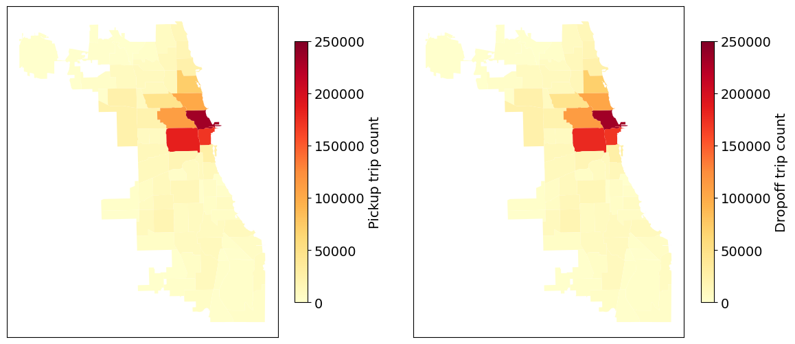
Figure 6. E-scooter pickup and dropoff trips (2022) in the City of Chicago, USA. There are 1,476,028 remaining trips after the data processing.
Taxi Travel Time Changes of Popular Pickup-Dropoff Pairs between 2019 and 2022
As shown in Figure 2 and Figure 4, there are some most popular pickup community areas, e.g., see left panel of Figure 2:
- Community area 8: 1,261,696 trips
- Community area 32: 888,724 trips
- Community area 76: 688,553 trips
- Community area 28: 448,476 trips
The pickup trips in these four areas are about 69% of all trips in 2022. For comparison, the left panel of Figure 4 shows that these four areas are also the most popular pickup areas. Specifically, we have
- Community area 8: 4,006,793 trips
- Community area 32: 3,647,522 trips
- Community area 28: 1,451,411 trips
- Community area 76: 1,096,552 trips
It seems to be 81.72% of all trips in 2019.
import pandas as pd

data19 = pd.read_csv('taxi_trip_2019.csv')
data22 = pd.read_csv('taxi_trip_2022.csv')

# Extract the most popular pickup areas
df19 = data19.groupby(['Pickup Community Area']).size().reset_index(name = 'pickup_counts')
df19 = df19.sort_values(by = ['pickup_counts'], ascending = False)
df22 = data22.groupby(['Pickup Community Area']).size().reset_index(name = 'pickup_counts')
df22 = df22.sort_values(by = ['pickup_counts'], ascending = False)
In what follows, one can choose some pickup-dropoff pairs to analyze taxi travel times.
# Return hour from datetime column
data19['hour'] = pd.to_datetime(data19['Trip Start Timestamp'],
                                errors = 'coerce').dt.hour
data22['hour'] = pd.to_datetime(data22['Trip Start Timestamp'],
                                errors = 'coerce').dt.hour
From Area 8 to Area 76
When analyzing taxi travel times and movement speeds, one should remove some outliers (e.g., anomalies in trip seconds/miles).
# From Area 8 to Area 76 in 2019
df1 = data19[(data19['Pickup Community Area'] == 8) & (data19['Dropoff Community Area'] == 76)]
df1 = df1.drop(df1[df1['Trip Seconds'] < 600].index)
df1 = df1.drop(df1[df1['Trip Seconds'] > 7200].index)
df1 = df1.drop(df1[df1['Trip Miles'] < 10].index)
df1 = df1.drop(df1[df1['Trip Miles'] > 25].index)

# From Area 8 to Area 76 in 2022
df2 = data22[(data22['Pickup Community Area'] == 8) & (data22['Dropoff Community Area'] == 76)]
df2 = df2.drop(df2[df2['Trip Seconds'] < 600].index)
df2 = df2.drop(df2[df2['Trip Seconds'] > 7200].index)
df2 = df2.drop(df2[df2['Trip Miles'] < 10].index)
df2 = df2.drop(df2[df2['Trip Miles'] > 25].index)
In what follows, we visualize the average travel time and speed from area 8 (i.e., Downtown) to area 76 (i.e., Airport) in both 2019 and 2022. Figure 7 shows average travel time curves and movement speed curves. It is not hard to see the remarkable reduction of average travel time in 2022 when comparing to 2019. The results of average speed demonstrate that the paths/routes from area 8 to area 76 is less congested in 2022 when comparing to 2019.
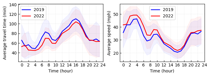
Figure 7. Average travel time and speed from area 8 (i.e., Downtown) to area 76 (i.e., Airport) in both 2019 and 2022.

Figure 8. Average travel time and speed from area 32 (i.e., Downtown) to area 76 (i.e., Airport) in both 2019 and 2022.
import numpy as np
import matplotlib.pyplot as plt

fig = plt.figure(figsize = (8, 2.5))
ax = fig.add_subplot(1, 2, 1)
# Average travel time in 2019
m1 = df1.groupby(['hour'])['Trip Seconds'].mean().values / 30
s1 = df1.groupby(['hour'])['Trip Seconds'].std().values / 30
plt.plot(m1, color = 'blue', linewidth = 1.8, label = '2019')
upper = m1 + s1
lower = m1 - s1
x_bound = np.append(np.append(np.append(np.array([0, 0]), np.arange(0, 24)),
                              np.array([24 - 1, 24 - 1])), np.arange(24 - 1, -1, -1))
y_bound = np.append(np.append(np.append(np.array([upper[0], lower[0]]), lower),
                              np.array([lower[-1], upper[-1]])), np.flip(upper))
plt.fill(x_bound, y_bound, color = 'blue', alpha = 0.05)

# Average travel time in 2022
m1 = df2.groupby(['hour'])['Trip Seconds'].mean().values / 30
s1 = df2.groupby(['hour'])['Trip Seconds'].std().values / 30
plt.plot(m1, color = 'red', linewidth = 1.8, label = '2022')
upper = m1 + s1
lower = m1 - s1
x_bound = np.append(np.append(np.append(np.array([0, 0]), np.arange(0, 24)),
                              np.array([24 - 1, 24 - 1])), np.arange(24 - 1, -1, -1))
y_bound = np.append(np.append(np.append(np.array([upper[0], lower[0]]), lower),
                              np.array([lower[-1], upper[-1]])), np.flip(upper))
plt.fill(x_bound, y_bound, color = 'red', alpha = 0.05)

plt.xticks(np.arange(0, 24 + 1, 2))
plt.xlabel('Time (hour)')
plt.ylabel('Average travel time (min)')
plt.grid(axis = 'both', linestyle='dashed', linewidth = 0.1, color = 'gray')
ax.tick_params(direction = "in")
ax.set_xlim([-1, 24])
plt.legend()

ax = fig.add_subplot(1, 2, 2)
# Average speed in 2019
df1['speed'] = df1['Trip Miles'].values / (df1['Trip Seconds'] / 3600)
m1 = df1.groupby(['hour'])['speed'].mean().values
s1 = df1.groupby(['hour'])['speed'].std().values
plt.plot(m1, color = 'blue', linewidth = 1.8, label = '2019')
upper = m1 + s1
lower = m1 - s1
x_bound = np.append(np.append(np.append(np.array([0, 0]), np.arange(0, 24)),
                              np.array([24 - 1, 24 - 1])), np.arange(24 - 1, -1, -1))
y_bound = np.append(np.append(np.append(np.array([upper[0], lower[0]]), lower),
                              np.array([lower[-1], upper[-1]])), np.flip(upper))
plt.fill(x_bound, y_bound, color = 'blue', alpha = 0.05)

# Average speed in 2022
df2['speed'] = df2['Trip Miles'].values / (df2['Trip Seconds'] / 3600)
m1 = df2.groupby(['hour'])['speed'].mean().values
s1 = df2.groupby(['hour'])['speed'].std().values
plt.plot(m1, color = 'red', linewidth = 1.8, label = '2022')
upper = m1 + s1
lower = m1 - s1
x_bound = np.append(np.append(np.append(np.array([0, 0]), np.arange(0, 24)),
                              np.array([24 - 1, 24 - 1])), np.arange(24 - 1, -1, -1))
y_bound = np.append(np.append(np.append(np.array([upper[0], lower[0]]), lower),
                              np.array([lower[-1], upper[-1]])), np.flip(upper))
plt.fill(x_bound, y_bound, color = 'red', alpha = 0.05)

plt.xticks(np.arange(0, 24 + 1, 2))
plt.xlabel('Time (hour)')
plt.ylabel('Average speed (mph)')
plt.grid(axis = 'both', linestyle='dashed', linewidth = 0.1, color = 'gray')
ax.tick_params(direction = "in")
ax.set_xlim([-1, 24])
plt.legend()

plt.savefig("travel_time_plus_speed_pickup_8_dropoff_76.png", bbox_inches = "tight")
plt.show()
(Posted by Xinyu Chen on November 12, 2023.)