
Sea Surface Temperature Dataset
The oceans play an important role in the global climate system. Exploiting sea surface temperature allows one to sense the climate and understand the dynamical processes of energy exchange at the sea surface. NOAA (National Oceanic and Atmospheric Administration) provides a large amount of sea surface temperature data from September 1, 1981 to the present date. These original data are processed as the daily optimum interpolation sea surface temperature using statistical interpolation methods (Huang et al., 2021).
Open Dataset
With the advent of satellite retrievals of sea surface temperature beginning in the early of 1980s, there are a large amount of high-resolution sea surface temperature data available for climate analysis, attracting a lot of attention. The NOAA 1/4 degree daily Optimum Interpolation Sea Surface Temperature (OISST)…
To build an intuitive understanding of sea surface temperature distribution, we consider the latest sea surface temperature dataset in July, 2024 as an example. There dataset include
- July 1, 2024:
oisst-avhrr-v02r01.20240701.nc - July 2, 2024:
oisst-avhrr-v02r01.20240702.nc - July 3, 2024:
oisst-avhrr-v02r01.20240703.nc
One is required to download these data files first from the website folder, and then use netCDF4 to open the dataset. There are a lot of important variables for analysis, including latitude lat, longitude lon, and temperature observations sst. As the values -999 refer to the unobserved part, we replace these values by nan in the NumPy array.
import numpy as np
import netCDF4 as nc

dataset = nc.Dataset('2024-07/oisst-avhrr-v02r01.20240701.nc', 'r').variables

lat = dataset['lat'][:].data
lon = dataset['lon'][:].data
sst = dataset['sst'][0, 0, :, :].data
sst[sst == -999] = np.nan
np.savez_compressed('lon.npz', lon)
np.savez_compressed('lat.npz', lon)
In the dataset, the daily temperature data is of size , corresponding to
grids in the global map.
import numpy as np
import netCDF4 as nc

m = 8
no = 31
data = np.zeros((720, 1440, no))
for mo in range(no):
    if m < 10:
        if mo + 1 < 10:
            dataset = nc.Dataset('oisst-avhrr-v02r01.19820{}0{}.nc'.format(m, mo + 1), 'r').variables
            print(mo + 1)
        else:
            dataset = nc.Dataset('oisst-avhrr-v02r01.19820{}{}.nc'.format(m, mo + 1), 'r').variables
            print(mo + 1)
    else:
        if mo + 1 < 10:
            dataset = nc.Dataset('oisst-avhrr-v02r01.1982{}0{}.nc'.format(m, mo + 1), 'r').variables
            print(mo + 1)
        else:
            dataset = nc.Dataset('oisst-avhrr-v02r01.1982{}{}.nc'.format(m, mo + 1), 'r').variables
            print(mo + 1)
    lat = dataset['lat'][:].data
    lon = dataset['lon'][:].data
    sst = dataset['sst'][0, 0, :, :].data
    sst[sst == -999] = np.nan
    data[:, :, mo] = sst
np.savez_compressed('lon.npz', lon)
np.savez_compressed('lat.npz', lon)
if m < 10:
    np.savez_compressed('sst_19820{}.npz'.format(m), np.mean(data, axis = 2))
else:
    np.savez_compressed('sst_1982{}.npz'.format(m), np.mean(data, axis = 2))
The SST data from September 1, 1981 to the latest date.
Visualize SST
For visualization, we use the contourf in matplotlib.pyplot to draw the matrix-form temperature data.
import matplotlib.pyplot as plt
from matplotlib.colors import LinearSegmentedColormap
plt.rc('font', family = 'Helvetica')

levels = np.linspace(0, 34, 18)
jet = ['blue', '#007FFF', 'cyan','#7FFF7F', 'yellow', '#FF7F00', 'red', '#7F0000']
cm = LinearSegmentedColormap.from_list('my_jet', jet, N = len(levels))
fig = plt.figure(figsize = (7, 4))
plt.contourf(dataset['lon'][:].data, dataset['lat'][:].data, sst,
             levels = levels, cmap = cm, extend = 'both')
plt.xticks(np.arange(60, 350, 60), ['60E', '120E', '180', '120W', '60W'])
plt.yticks(np.arange(-60, 90, 30), ['60S', '30S', 'EQ', '30N', '60N'])
cbar = plt.colorbar(fraction = 0.022)
plt.show()
fig.savefig('sst_2407_1.png', bbox_inches = 'tight')
Figure 1 shows the temperature data from July 1 to July 3 in 2024.
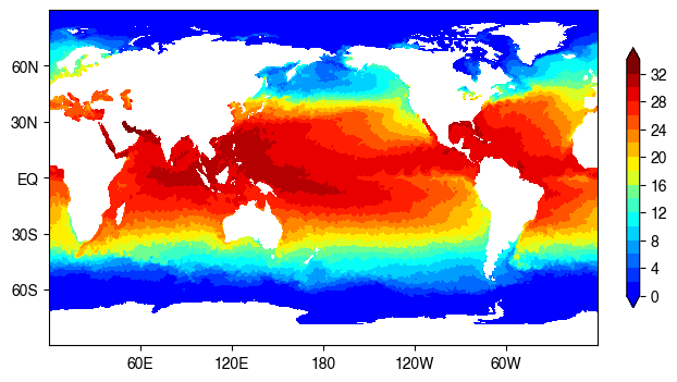
(a) On July 1, 2024.
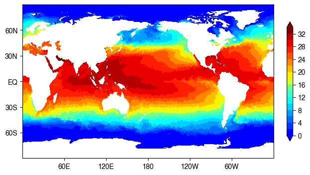
(b) On July 2, 2024.

(c) On July 3, 2024.
Figure 1. Daily sea surface temperature data with optimum interpolation. The unit of temperature data is centigrade ().
Conclusion
This post introduces how to visualize the sea surface temperature data in Python. The dataset is publicly available since September 1981, allowing one to identify the climate change and anomalies in the past ~40 years.
(Posted by Xinyu Chen and Fuqiang Liu on July 29, 2024.)