Visualizing Global Water Vapor Patterns in Python
Exploring Water Vapor Patterns Across Time with High-Resolution Monthly Aggregated Datasets
In the realm of Earth observation, the power of data is truly remarkable. One dataset that has been making waves in the scientific community is the Monthly Aggregated Water Vapor MODIS MCD19A2 (1km) dataset. In this post, we will dive into this dataset’s significance, applications, and how it is shaping our understanding of water vapor dynamics across the globe. For an intuitive demonstration, we will tell how to visualize the dataset by Python as a sequence of heatmps.
About the Dataset
Imagine having the ability to observe water vapor behavior on a global scale, month by month, over a span of more than two decades. Thanks to the dedicated work of Leandro Parente, Rolf Simoes, and Tomislav Hengl, such a dataset exists. The dataset takes us on an illuminating journey into Earth’s water vapor patterns from 2000 to 2022.
- Monthly aggregated Water Vapor MODIS MCD19A2 (1 km): Monthly time-series (2000-2002)
- Monthly aggregated Water Vapor MODIS MCD19A2 (1 km): Monthly time-series (2003-2005)
- Monthly aggregated Water Vapor MODIS MCD19A2 (1 km): Monthly time-series (2006-2008)
- Monthly aggregated Water Vapor MODIS MCD19A2 (1 km): Monthly time-series (2009-2011)
- Monthly aggregated Water Vapor MODIS MCD19A2 (1 km): Monthly time-series (2012-2014)
- Monthly aggregated Water Vapor MODIS MCD19A2 (1 km): Monthly time-series (2015-2017)
- Monthly aggregated Water Vapor MODIS MCD19A2 (1 km): Monthly time-series (2018-2020)
- Monthly aggregated Water Vapor MODIS MCD19A2 (1 km): Monthly time-series (2021-2022)
The Power of Water Vapor Data
Derived from MCD19A2 v061 and utilizing MODIS near-IR bands at 0.94μm, this dataset measures the column of water vapor above the ground. Its applications are as vast as the oceans it helps us understand. From water cycle modeling to vegetation and soil mapping, the insights this dataset provides are invaluable for numerous fields.
Dataset Highlights
-
Monthly Time-Series: The heart of the dataset lies in its monthly time-series. These provide a monthly aggregated mean and standard deviation of daily water vapor time-series data. Only clear-sky pixels are considered, ensuring the accuracy of observations. The Whittaker method helps smooth mean and standard deviation values, while quality assessment layers add reliability to the mix.
-
Yearly Time-Series: Zooming out, the yearly time-series present aggregated statistics of the monthly data. This zoomed-out perspective offers a bird’s-eye view of water vapor trends over the course of a year.
-
Long-Term Insights: The real gem lies in the long-term data. Derived from monthly time-series, it offers aggregated statistics that encapsulate the entire spectrum of observations from 2000 to 2022. It is like looking at the evolution of Earth’s breath over two decades.
Behind the Scenes
The data’s journey from raw observations to insightful statistics is a testament to modern technology. Utilizing the power of Google Earth Engine, the data is derived from MCD19A2 v061. Cloudy pixels are removed, and only positive water vapor values are considered. The magic of Scikit-map Python package handles time-series gap-filling and smoothing, while four essential statistics—standard deviation and percentiles 25, 50, and 75—provide depth to the dataset.
Limitations and Spatial Details
No dataset is without its boundaries. This dataset does not cover Antarctica, and its geographic scope is defined by the bounding box (-180.00000, -62.00081, 179.99994, 87.37000). With a spatial resolution of 1km, the image size is an impressive pixels. To keep up with the latest technological trends, the dataset is available in Cloud Optimized Geotiff (COG) format.
Step-By-Step Data Visualization
This post gives some Python codes for generating the water vapor heatmaps. For an example, we only visualize some areas in North America because visualizing the global water vapor heatmaps consumes a lot of computer memory. You can adjust the rows and columns of the data matrix if you want to explore different areas in the world.
Requirements
This Python package and extensions are a number of tools for programming and manipulating the GDAL Geospatial Data Abstraction Library. We need to first install this package.
pip install GDAL
Download Dataset
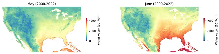
Check out the data and view/download some data files. Below show three subsets that corresponding to the months of May, June, and July.

Generating Water Vapor Heatmaps
To generate heatmaps, we can use some basic Python packages for data visualization, e.g., matplotlib and seaborn. We can represent the data as a numpy array for inputing seaborn heatmaps.
import numpy as np
from osgeo import gdal
import matplotlib.pyplot as plt
import seaborn as sns

fig = plt.figure(figsize = (14, 3))
i = 0
for month in [5, 6]:
    dataset = gdal.Open(r'wv_mcd19a2v061.seasconv.m.m0{}_p50_1km_s_20000101_20221231_go_epsg.4326_v20230619.tif'.format(month))
    mat = np.array(dataset.GetRasterBand(1).ReadAsArray()[4500 : 8000, 6600 : 13100]).astype(float)
    mat[mat == -1] = np.nan
    ax = fig.add_subplot(1, 2, i + 1)
    ax = sns.heatmap(mat,  cmap = "Spectral_r", vmin = 0, vmax = 4500,
                     cbar_kws = {"shrink": 0.5, 'label': r'Water vapor ($10^{-3}$cm)'})
    plt.axis('off')
    if month == 5:
        plt.title('May (2000-2022)')
    elif month == 6:
        plt.title('June (2000-2022)')
    i += 1
plt.show()
Running these codes, we have the following heatmaps:
import numpy as np
from osgeo import gdal
import matplotlib.pyplot as plt
import seaborn as sns

dataset = gdal.Open(r'wv_mcd19a2v061.seasconv.m.m06_p50_1km_s_20000101_20221231_go_epsg.4326_v20230619.tif')
mat = np.array(dataset.GetRasterBand(1).ReadAsArray()[4500 : 8000, 6600 : 13100]).astype(float)
mat[mat == -1] = np.nan
fig = plt.figure(figsize = (6.5, 3))
ax = sns.heatmap(mat,  cmap = "Spectral_r", vmin = 0, vmax = 4500,
                  cbar_kws = {"shrink": 0.5, 'label': r'Water vapor ($10^{-3}$cm)'})
plt.axis('off')
plt.title('June (2000-2022)')
plt.show()

If you prefer to visualize the areas in aforementioned figures, please check out our GitHub repository. We represent only a fraction of data as samples for analysis. Each data file is in the .npz format and can be easily processed with numpy package in Python.
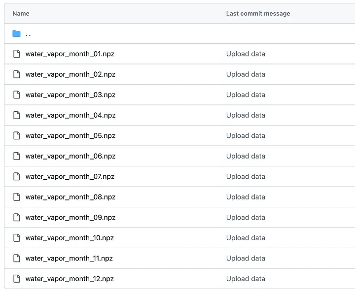
We processed water vapor data in 12 months for the selected areas. You can check out the following codes to generate the water vapor heatmap.
import numpy as np
import matplotlib.pyplot as plt
import seaborn as sns
fig = plt.figure(figsize = (14, 3))
i = 0
for month in [5, 6]:
    mat = np.load('water_vapor_month_0{}.npz'.format(month))['arr_0']
    ax = fig.add_subplot(1, 2, i + 1)
    ax = sns.heatmap(mat,  cmap = "Spectral_r", vmin = 0, vmax = 4500,
                     cbar_kws = {"shrink": 0.5, 'label': r'Water vapor ($10^{-3}$cm)'})
    plt.axis('off')
    if month == 5:
        plt.title('May (2000-2022)')
    elif month == 6:
        plt.title('June (2000-2022)')
    i += 1
plt.show()
Conclusion
The global water vapor dataset is a testament to the power of data-driven insights. It is a treasure trove for scientists, researchers, and enthusiasts eager to understand the intricate dance of water vapor across our planet. As we analyze its patterns and trends, we are reminded once again of the beauty and complexity of Earth’s natural systems.
(Posted by Xinyu Chen on November 27, 2023.)