Time-Varying Autoregression
Discovering Dynamic Patterns from Spatiotemporal Data with Time-Varying Low-Rank Autoregression
Dynamic mechanisms that drive nonlinear systems are universally complex. Straightforwardly, one can investigate the behavior of a system by discovering the interpretable dynamic patterns from real-world data. In practice, when we take observations from a real-world complex system, spatiotemporal data are one of the most widely encountered from relating to space and time and showing the characteristics of time series. Without loss of generality, leveraging time series models not only allows one to analyze spatiotemporal data but also makes it possible to discover inherent spatial and temporal patterns from the data over space and time. The scientific question in our study (see Chen et al., 2024) is how to discover interpretable dynamic patterns from spatiotemporal data (or say how to identify the temporal modes of dynamical systems). We utilize the vector autoregression as a basic tool to explore the spatiotemporal data in real-world applications.
@article{chen2024discovering,
  title={Discovering dynamic patterns from spatiotemporal data with time-varying low-rank autoregression},
  author={Chen, Xinyu and Zhang, Chengyuan and Chen, Xiaoxu and Saunier, Nicolas and Sun, Lijun},
  journal={IEEE Transactions on Knowledge and Data Engineering},
  volume={36},
  number={2},
  pages={504--517},
  year={2024},
  publisher={IEEE}
}
Content:
- Revisit Vector Autoregression
- Tensor Factorization on the Coefficient Tensor
- Fluid Flow Data
- Sea Surface Temperature Data
- Conclusion
Revisit Vector Autoregression
As a simple yet efficient and classical method for time series modeling, vector autoregression allows one to explicitly find the linear relationship among a sequence of time series (i.e., multivariate time series) changing over time, which can also successfully describe the dynamic behaviors of time series.
Given any stationary time series , the
th-order vector autoregression takes a linear time-invariant formula as
where are the coefficient matrices, which can capture the temporal correlations of the multivariate time series.
One great challenge of modeling time series with vector autoregression is identifying the time-varying system behaviors in the analysis, which is often associated with the nonstationarity issue. Although the nonstationarity and time-varying system behaviors are pretty clear to verify, the problem of discovering underlying data patterns from time-varying systems is challenging and still demands further exploration.
Typically, time-varying vector autoregression takes a sequence of vector autoregressive processes at different times, and it is capable of handling the time-varying system behaviors. For any observed spatiotemporal data in the form of multivariate time series, i.e., , our model considers a linear time-varying system as follows,
whose optimization problem of the time-varying autoregression is given by
with the data pair:
As the data pair is readily available, one can learn the coefficient matrices
.
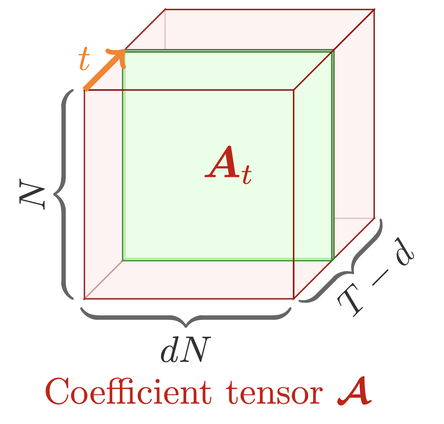
Figure 1. A collection of coefficient matrices can be represented as a coefficient tensor
of size
, showing
parameters for estimation.
As shown in Figure 1, the coefficient matrices can be viewed as a coefficient tensor whose parameters are of number . Since there are only
time series observations, one technical challenge for solving the optimization problem would arise as the over-parameterization issue in the modeling process.
Tensor Factorization on the Coefficient Tensor
To compress the coefficient tensor in the time-varying autoregression and capture spatiotemporal patterns simultaneously, we factorize the coefficient tensors into a sequence of components via the use of Tucker tensor decomposition:
where and
can be interpreted as spatial modes/patterns and temporal modes/patterns, respectively.
Putting this tensor factorization with time-varying autoregression together, we have the following time-varying low-rank vector autoregression problem (also see the optimization with orthogonal constraints):
or see the optimization problem as follows,
We can use the alternating minimization method to solve this optimization problem. Let be the objective function of the optimization problem, the scheme can be summarized as follows,
Notably, the partial derivative of with respect to the variable
(See Eqs. (14-23) in Chen et al., 2024) can also be written as follows,
To reproduce the time-varying model, the Python implementation with numpy is given as follows. We plan to give some spatiotemporal data examples such as fluid flow, sea surface temperature, and human mobility for discovering interpretable patterns.
import numpy as np

def update_cg(w, r, q, Aq, rold):
    alpha = rold / np.inner(q, Aq)
    w = w + alpha * q
    r = r - alpha * Aq
    rnew = np.inner(r, r)
    q = r + (rnew / rold) * q
    return w, r, q, rnew

def ell_v(Y, Z, W, G, V_transpose, X, temp2, d, T):
    rank, dN = V_transpose.shape
    temp = np.zeros((rank, dN))
    for t in range(d, T):
        temp3 = np.outer(X[t, :], Z[:, t - d])
        Pt = temp2 @ np.kron(X[t, :].reshape([rank, 1]), V_transpose) @ Z[:, t - d]
        temp += np.reshape(Pt, [rank, rank], order = 'F') @ temp3
    return temp

def conj_grad_v(Y, Z, W, G, V_transpose, X, d, T, maxiter = 5):
    rank, dN = V_transpose.shape
    temp1 = W @ G
    temp2 = temp1.T @ temp1
    v = np.reshape(V_transpose, -1, order = 'F')
    temp = np.zeros((rank, dN))
    for t in range(d, T):
        temp3 = np.outer(X[t, :], Z[:, t - d])
        Qt = temp1.T @ Y[:, t - d]
        temp += np.reshape(Qt, [rank, rank], order = 'F') @ temp3
    r = np.reshape(temp - ell_v(Y, Z, W, G, V_transpose, X, temp2, d, T), -1, order = 'F')
    q = r.copy()
    rold = np.inner(r, r)
    for it in range(maxiter):
        Q = np.reshape(q, (rank, dN), order = 'F')
        Aq = np.reshape(ell_v(Y, Z, W, G, Q, X, temp2, d, T), -1, order = 'F')
        v, r, q, rold = update_cg(v, r, q, Aq, rold)
    return np.reshape(v, (rank, dN), order = 'F')

def trvar(mat, d, rank, maxiter = 50):
    N, T = mat.shape
    Y = mat[:, d : T]
    Z = np.zeros((d * N, T - d))
    for k in range(d):
        Z[k * N : (k + 1) * N, :] = mat[:, d - (k + 1) : T - (k + 1)]
    u, _, v = np.linalg.svd(Y, full_matrices = False)
    W = u[:, : rank]
    u, _, _ = np.linalg.svd(Z, full_matrices = False)
    V = u[:, : rank]
    u, _, _ = np.linalg.svd(mat.T, full_matrices = False)
    X = u[:, : rank]
    del u
    loss = np.zeros(maxiter)
    for it in range(maxiter):
        temp1 = np.zeros((N, rank * rank))
        temp2 = np.zeros((rank * rank, rank * rank))
        for t in range(d, T):
            temp = np.kron(X[t, :].reshape([rank, 1]), V.T) @ Z[:, t - d]
            temp1 += np.outer(Y[:, t - d], temp)
            temp2 += np.outer(temp, temp)
        G = np.linalg.pinv(W) @ temp1 @ np.linalg.inv(temp2)
        W = temp1 @ G.T @ np.linalg.inv(G @ temp2 @ G.T)
        V = conj_grad_v(Y, Z, W, G, V.T, X, d, T).T
        temp3 = W @ G
        for t in range(d, T):
            X[t, :] = np.linalg.pinv(temp3 @ np.kron(np.eye(rank), (V.T @ Z[:, t - d]).reshape([rank, 1]))) @ Y[:, t - d]
    return W, G, V, X
Fluid Flow Data
Investigating fluid dynamic systems is of great interest for uncovering large-scale spatiotemporal coherent structures because dominant patterns exist in the flow field. The data-driven models, such as proper orthogonal decomposition and dynamic mode decomposition, have become an important paradigm. To analyze the underlying spatiotemporal patterns of fluid dynamics, we consider the cylinder wake dataset in which the flow shows a supercritical Hopf bifurcation.
Fluid Flow Dataset
The cylinder wake dataset is collected from the fluid flow passing a circular cylinder with laminar vortex shedding at Reynolds number Re = 100, which is larger than the critical Reynolds number, using direct numerical simulations of the Navier-Stokes equations. This is a representative three-dimensional flow dataset in fluid dynamics, consisting of matrix-variate time series of vorticity field snapshots for the wake behind a cylinder (see Figure 2). The dataset is of size , representing 199-by-449 vorticity fields with 150 time snapshots. The adapted dataset is available at our GitHub repository, including two data files:
CCcool.mattensor.npz
import numpy as np
import seaborn as sns
import scipy.io
import matplotlib.pyplot as plt
from matplotlib.colors import LinearSegmentedColormap
color = scipy.io.loadmat('CCcool.mat')
cc = color['CC']
newcmp = LinearSegmentedColormap.from_list('', cc)

tensor = np.load('tensor.npz')['arr_0']
tensor = tensor[:, :, : 150]
M, N, T = tensor.shape

plt.rcParams['font.size'] = 13
plt.rcParams['mathtext.fontset'] = 'cm'
fig = plt.figure(figsize = (7, 8))
id = np.array([5, 10, 15, 20, 25, 30, 35, 40])
for t in range(8):
    ax = fig.add_subplot(4, 2, t + 1)
    ax = sns.heatmap(tensor[:, :, id[t] - 1], cmap = newcmp, vmin = -5, vmax = 5, cbar = False)
    ax.contour(np.linspace(0, N, N), np.linspace(0, M, M), tensor[:, :, id[t] - 1],
               levels = np.linspace(0.15, 15, 30), colors = 'k', linewidths = 0.7)
    ax.contour(np.linspace(0, N, N), np.linspace(0, M, M), tensor[:, :, id[t] - 1],
               levels = np.linspace(-15, -0.15, 30), colors = 'k', linestyles = 'dashed', linewidths = 0.7)
    plt.xticks([])
    plt.yticks([])
    plt.title(r'$t = {}$'.format(id[t]))
    for _, spine in ax.spines.items():
        spine.set_visible(True)
plt.show()
fig.savefig('fluid_flow_heatmap.png', bbox_inches = 'tight')
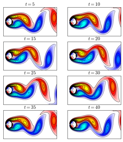
Figure 2: Heatmaps (snapshots) of the fluid flow at times . It shows that the snapshots at times
and
are even same, and the snapshots at times
and
are also even same, implying the seasonality as 30 for the first 50 snapshots.
We manually build a synthetic dataset based on fluid dynamics observations to test the proposed model. First, we can reshape the data as a high-dimensional multivariate time series matrix of size . Then, to manually generate a multi-resolution system in which the fluid flow takes time-varying system behaviors, we concatenate two phases of data with different frequencies, namely, putting the first 50 time snapshots (of original frequency) together with the uniformly sampled 50 time snapshots from the last 100 time snapshots (of double frequency). As a consequence, the newly-built fluid flow dataset for evaluation has 100 time snapshots in total but with a frequency transition in its system behaviors, i.e., posing different frequencies in two phases.
In our model, rank is a key parameter, which directly determines the number of dominant spatial/temporal modes. In practice, a lower rank may only reveal a few low-frequency dominant modes, but a higher rank would bring some complicated and less interpretable modes, usually referring to high-frequency information. This is consistent with the law that nature typically follows—noise is usually dominant at high frequencies and the system signal is more dominant at lower frequencies. On this dataset, we set the rank of our model as 7.
import numpy as np
import time

tensor = np.load('tensor.npz')['arr_0']
tensor = tensor[:, :, : 150]
M, N, T = tensor.shape
mat = np.zeros((M * N, 100))
mat[:, : 50] = np.reshape(tensor[:, :, : 50], (M * N, 50), order = 'F')
for t in range(50):
    mat[:, t + 50] = np.reshape(tensor[:, :, 50 + 2 * t + 1], (M * N), order = 'F')

for rank in [7]:
    for d in [1]:
        start = time.time()
        W, G, V, X = trvar(mat, d, rank)
        print('rank R = {}'.format(rank))
        print('Order d = {}'.format(d))
        end = time.time()
        print('Running time: %d seconds'%(end - start))
Spatial Modes
In this case, the matrix has 7 columns, corresponding to the 7 spatial modes. To analyze these spatial modes, one needs to first reshape each column vector as the 199-by-449 matrix and then use the packages
seaborn and matplotlib.
import seaborn as sns
import scipy.io
import matplotlib.pyplot as plt
from matplotlib.colors import LinearSegmentedColormap
color = scipy.io.loadmat('CCcool.mat')
cc = color['CC']
newcmp = LinearSegmentedColormap.from_list('', cc)

plt.rcParams['font.size'] = 12
fig = plt.figure(figsize = (7, 8))
ax = fig.add_subplot(4, 2, 1)
sns.heatmap(np.mean(tensor, axis = 2),
            cmap = newcmp, vmin = -5, vmax = 5, cbar = False)
ax.contour(np.linspace(0, N, N), np.linspace(0, M, M), np.mean(tensor, axis = 2),
            levels = np.linspace(0.15, 15, 20), colors = 'k', linewidths = 0.7)
ax.contour(np.linspace(0, N, N), np.linspace(0, M, M), np.mean(tensor, axis = 2),
            levels = np.linspace(-15, -0.15, 20), colors = 'k', linestyles = 'dashed', linewidths = 0.7)
plt.xticks([])
plt.yticks([])
plt.title('Mean vorticity field')
for _, spine in ax.spines.items():
    spine.set_visible(True)
for t in range(7):
    if t == 0:
        ax = fig.add_subplot(4, 2, t + 2)
    else:
        ax = fig.add_subplot(4, 2, t + 2)
    ax = sns.heatmap(W[:, t].reshape((199, 449), order = 'F'),
                     cmap = newcmp, vmin = -0.03, vmax = 0.03, cbar = False)
    if t < 3:
        num = 20
    else:
        num = 10
    ax.contour(np.linspace(0, N, N), np.linspace(0, M, M), W[:, t].reshape((199, 449), order = 'F'),
               levels = np.linspace(0.0005, 0.05, num), colors = 'k', linewidths = 0.7)
    ax.contour(np.linspace(0, N, N), np.linspace(0, M, M), W[:, t].reshape((199, 449), order = 'F'),
               levels = np.linspace(-0.05, -0.0005, num), colors = 'k', linestyles = 'dashed', linewidths = 0.7)
    plt.xticks([])
    plt.yticks([])
    plt.title('Spatial mode {}'.format(t + 1))
    for _, spine in ax.spines.items():
        spine.set_visible(True)
plt.show()
fig.savefig("fluid_mode_trvar.png", bbox_inches = "tight")
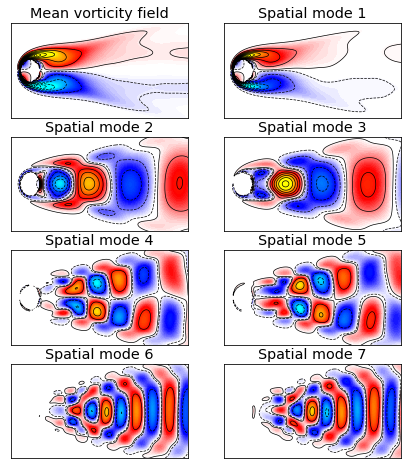
Figure 3: Mean vorticity field and spatial modes of the fluid flow. Spatial modes are plotted by the columns of in which seven panels correspond to the rank
. Note that the colorbars of all modes are on the same scale.
Figure 3 shows the spatial modes of the fluid flow revealed by our model. It demonstrates that the spatial mode 1 corresponds to a background mode that is not changing over time because it is consistent with the mean vorticity. The other dominant spatial modes essentially show the waves of fluid flow. With the increase of rank , the spatial modes can be more detailed.
Temporal Modes
In this case, the matrix has 7 columns, which can visualized as 7 signals to see the dynamic patterns of the fluid flow.
import matplotlib.pyplot as plt
import matplotlib.patches as patches

plt.rcParams['font.size'] = 14
plt.rcParams['mathtext.fontset'] = 'cm'
fig = plt.figure(figsize = (7, 9))
for t in range(7):
    ax = fig.add_subplot(7, 1, t + 1)
    plt.plot(np.arange(1, 101, 1), X[:, t], linewidth = 2, alpha = 0.8, color = 'red')
    plt.xlim([1, 100])
    plt.xticks(np.arange(0, 101, 10))
    if t < 6:
        ax.tick_params(labelbottom = False)
    ax.tick_params(direction = "in")
    rect = patches.Rectangle((0, -1), 50, 2, linewidth=2,
                             edgecolor='gray', facecolor='red', alpha = 0.1)
    ax.add_patch(rect)
    rect = patches.Rectangle((50, -1), 50, 2, linewidth=2,
                             edgecolor='gray', facecolor='yellow', alpha = 0.1)
    ax.add_patch(rect)
plt.xlabel('$t$')
plt.show()
fig.savefig("fluid_temporal_mode.png", bbox_inches = "tight")
# fig.savefig("fluid_temporal_mode.pdf", bbox_inches = "tight")
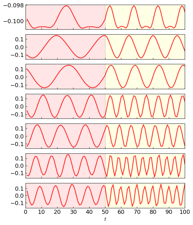
Figure 4: Temporal modes of the fluid flow in in which seven panels correspond to the rank
.
Figure 4 shows the temporal modes of the fluid flow achieved by our model. As can be seen, the frequency of all temporal modes is changed at the time , and all temporal modes can identify the time series with different frequencies of oscillation. The dynamics of fluid flow essentially consist of the phases of two frequencies. Thus, we can emphasize the model’s ability for identifying the time-evolving patterns from multi-resolution fluid flow.
The temporal mode 1 is the most dominant pattern of the fluid flow, corresponding to the spatial mode 1. Observing the harmonic frequencies of temporal modes, the corresponding spatial modes 4 and 5 are more complicated than the spatial modes 2 and 3, while the spatial modes 6 and 7 are more complicated than the spatial modes 4 and 5. With higher rank, the frequency of harmonic cycles increases, implying that the importance of the latter modes are secondary and the last spatial/temporal modes represent high-frequency information. Therefore, we can tell that our model can discover both spatial and temporal modes from the spatiotemporal data with time-varying system behaviors.
Sea Surface Temperature Data
The oceans play an important role in the global climate system. Exploiting the temperature of sea surface allows one to sense the climate and understand the dynamical processes of energy exchange at the sea surface. Sea surface temperature (SST) data is therefore crucial to many research and analysis.
SST Dataset
With the advent of satellite retrievals of SST beginning in the early of 1980s, it is possible to access the high-resolution SST data in both spatial and temporal dimensions. NOAA Optimum Interpolation (OI) SST V2 is a well-document SST dataset, attracting a lot of attention. Opening the download page, we can check out the data files as follows,
sst.wkmean.1990-present.nclsmask.nc
As can be seen, these data files are with .nc format. This format is NetCDF, which stands for Network Common Data Form. The climate data has multiple dimensions, including latitude, longitude, and SST (usually in the form of multi-dimensional arrays). As we have an SST data file and a land-sea mask data file, we can use the package numpy to convert the data into arrays and save the SST data as follows (see our GitHub repository),
sst_500w.npz(the data in the first 500 weeks)sst_1000w.npz(the data from the 500th week to the 1000th week)sst_1000w.npz(the data from the 1000th week to present)
from scipy.io import netcdf
import numpy as np

# weekly SST data
temp = netcdf.NetCDFFile('sst.wkmean.1990-present.nc', 'r').variables
data = temp['sst'].data[:, :, :] / 100
np.savez_compressed('sst_500w.npz', data[: 500, :, :])
np.savez_compressed('sst_1000w.npz', data[500 : 1000, :, :])
np.savez_compressed('sst_lastw.npz', data[1000 :, :, :])
There are three critical variables that will be used for visualization, including lon (longitude), lat (latitude), and sst (sea surface temperature data tensor of size ). Let
mask be the land-sea mask, we need to let the zero values be np.nan.
from scipy.io import netcdf
import numpy as np

tensor = np.load('sst_500w.npz')['arr_0']
tensor = np.append(tensor, np.load('sst_1000w.npz')['arr_0'], axis = 0)
tensor = np.append(tensor, np.load('sst_lastw.npz')['arr_0'], axis = 0)
tensor = tensor[: 1565, :, :] # A 30-year period from 1990 to 2019

# land-sea mask
mask = netcdf.NetCDFFile('lsmask.nc', 'r').variables['mask'].data[0, :, :]
mask = mask.astype(float)
mask[mask == 0] = np.nan
The SST dataset covers the weekly data over 1,565 weeks from 1990 to 2019, i.e., a 30-year period. We can visualize the historical averages of long-term SST. First, we define the colormap (colors changing from blue, cyan, yellow to red) for the heatmap. Then, we use the function contourf in matplotlib.pyplot to draw the long-term mean of weekly SST data.
import matplotlib.pyplot as plt
from matplotlib.colors import LinearSegmentedColormap

levs = np.arange(16, 29, 0.05)
jet = ["blue", "#007FFF", "cyan","#7FFF7F", "yellow", "#FF7F00", "red", "#7F0000"]
cm = LinearSegmentedColormap.from_list('my_jet', jet, N = len(levs))

plt.rcParams['font.size'] = 12
fig = plt.figure(figsize = (7, 4))
plt.contourf(np.flip(np.mean(tensor, axis = 0) * mask, axis = 0),
             levels = 20, linewidths = 1, vmin = 0, cmap = cm)
plt.xticks(np.arange(60, 360, 60), ['60E', '120E', '180', '120W', '60W'])
plt.yticks(np.arange(30, 180, 30), ['60S', '30S', 'EQ', '30N', '60N'])
cbar = plt.colorbar(fraction = 0.022)
plt.show()
fig.savefig("mean_temperature.png", bbox_inches = "tight")
# fig.savefig("mean_temperature.pdf", bbox_inches = "tight")
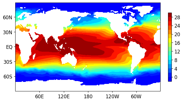
Figure 5: Long-term mean of the SST dataset from 1990 to 2019.
Figure 5 shows the geographical distribution of the SST dataset. By using these visualization results, it is possible to analyze the climate change and identify anomalies in the last 30+ years. Figure 6 shows the yearly cycle (about 52 weeks) of time series of the mean temperature.
import matplotlib.pyplot as plt

T, M, N = tensor.shape
mat = np.zeros((M * N, T))
for t in range(T):
    mat[:, t] = tensor[t, :, :].reshape([M * N])

plt.rcParams['font.size'] = 11
fig = plt.figure(figsize = (8, 0.8))
ax = fig.add_subplot(1, 1, 1)
plt.plot(np.mean(mat, axis = 0), color = 'red', linewidth = 2, alpha = 0.6)
plt.axhline(y = np.mean(np.mean(mat)), color = 'gray', alpha = 0.5, linestyle='dashed')
plt.xticks(np.arange(1, 1565 + 1, 52 * 2), np.arange(1990, 2020 + 1, 2))
plt.grid(axis = 'both', linestyle='dashed', linewidth = 0.1, color = 'gray')
ax.tick_params(direction = "in")
ax.set_xlim([0, 1565])
plt.show()
fig.savefig("mean_temperature_time_series.png", bbox_inches = "tight")
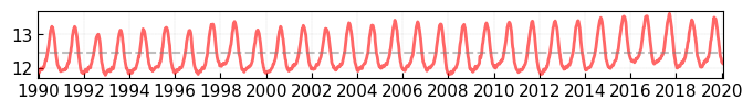
Figure 6: Time series of the mean temperature on the SST dataset from 1990 to 2019.
Model Evaluation
For evaluating our model, one can use GPU sources to accelerate the computing processing. Instead of numpy in the CPU computing environment, the package cupy shows to be a great toolbox for reproducing any Python codes with numpy and supporting the GPU computing environment. The only change in our algorithm implementation would be replacing import numpy as np by import cupy as np.
import cupy as np
from scipy.io import netcdf
import time

tensor = np.load('sst_500w.npz')['arr_0']
tensor = np.append(tensor, np.load('sst_1000w.npz')['arr_0'], axis = 0)
tensor = np.append(tensor, np.load('sst_lastw.npz')['arr_0'], axis = 0)
tensor = tensor[: 1565, :, :] # A 30-year period from 1990 to 2019
T, M, N = tensor.shape
mat = np.zeros((M * N, T))
for t in range(T):
    mat[:, t] = tensor[t, :, :].reshape([M * N])

for rank in [6]:
    for d in [1]:
        start = time.time()
        W, G, V, X = trvar(mat, d, rank)
        print('rank R = {}'.format(rank))
        print('Order d = {}'.format(d))
        end = time.time()
        print('Running time: %d seconds'%(end - start))
For visualization, one needs to convert CuPy arrays as NumPy arrays, e.g., W = np.asnumpy(W) and X = np.asnumpy(X). Using our model with rank , we plot the spatial modes of the SST data as shown in Figure 7. As shown in the spatial mode 5, our model can identify the phenomenon of El Nino Southern Oscillation (with both of El Nino and La Nina), as well as the Pacific Decadal Oscillation.
import numpy as np
import seaborn as sns
import scipy.io
import matplotlib.pyplot as plt
from matplotlib.colors import LinearSegmentedColormap

levs = np.arange(16, 29, 0.05)
jet=["blue", "#007FFF", "cyan","#7FFF7F", "yellow", "#FF7F00", "red", "#7F0000"]
cm = LinearSegmentedColormap.from_list('my_jet', jet, N=len(levs))

mask = netcdf.NetCDFFile('lsmask.nc', 'r').variables['mask'].data[0, :, :]
mask = mask.astype(float)
mask[mask == 0] = np.nan

fig = plt.figure(figsize = (8, 6))
for t in range(6):
    ax = fig.add_subplot(3, 2, t + 1)
    plt.contourf(np.flip(W[:, t].reshape((M, N)) * mask, axis = 0),
                 levels = 20, linewidths = 1,
                 vmin = -0.015, vmax = 0.015, cmap = cm)
    plt.xticks([])
    plt.yticks([])
    plt.title('Spatial mode {}'.format(t + 1))
    for _, spine in ax.spines.items():
        spine.set_visible(True)
plt.show()
fig.savefig("temperature_mode_trvar.png", bbox_inches = "tight")
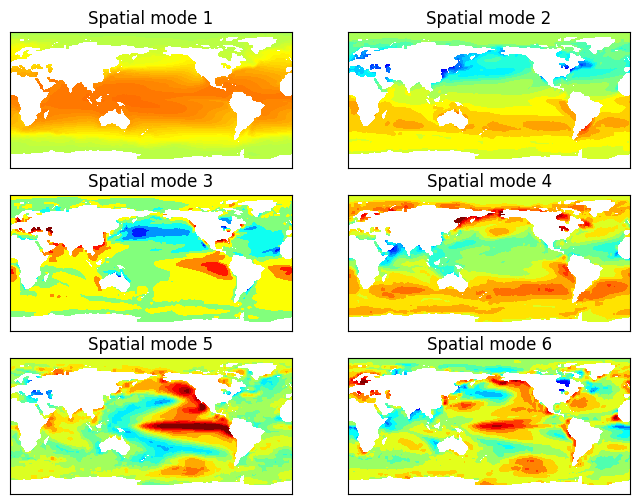
Figure 7: Geographical distribution of spatial modes of the SST data achieved by our model.
Conclusion
This post presents a time-varying low-rank vector autoregression model for discovering interpretable modes from time series, providing insights into modeling real-world time-varying spatiotemporal systems. Experiments demonstrate that the model can reveal meaningful spatial and temporal patterns underlying the time series through interpretable modes.
(Posted by Xinyu Chen on December 13, 2023.)